 |
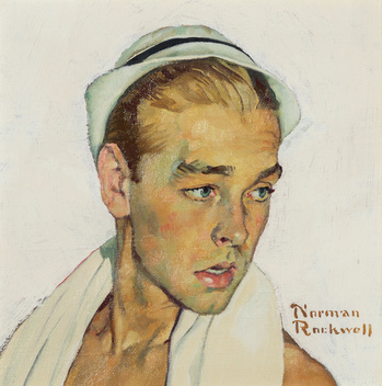
| Shallow Depth of Field I |
As one can see the depth of field is clearly based upon the subject, as the background is completely blurred, it was the photographer's vision that one shan't be able to the view whatever those lights are. Only the immediate visage is viewable, even the subject's collar is out of focus.
The picture most left below is also an exemplar of a specific depth of field. The immediate cylindrical studding in the foreground are out of focus, to which after the third stud they are then go back out of focus by the sixth, right where the lego man's space ends.
 |
| Shallow Depth of Field II |
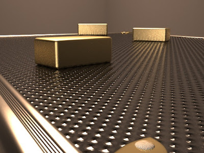 |
| Long Depth of Field I |
The gold bricks within the photo are no more in or out
of focus than the table's various convexes, meaning
that the photo possesses a long depth of field.
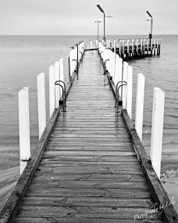 |
| Long Depth of Field II |
Once again, the white planks of wood on the dock are all, generally, equally focused, and as such, this was a photo with a long depth of field.
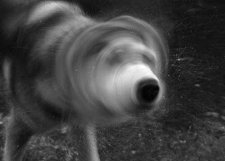 |
| Slow Shutter Speed I |
The photo's shutter speed was slow enough to not capture the big old doggo's face during mid-shake.
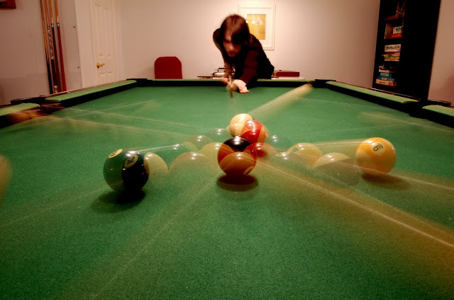 |
| Slow Shutter Speed II |
In an excellent display of camera prowess, this photo successfully captured a pool break before and after it started.
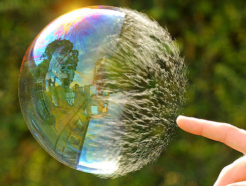 |
| Fast Shutter Speed I |
A photo of a bubble in it's process of popping, only achievable with a high shutter speed.
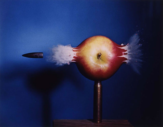 |
Fast Shutter Speed II
This excellent display of marksmanship and skill in photography is a photo of an apple, propped by a rifle round, being shot. Using a fast shutter speed, the photographer was able to capture the apple being shot, displaying its insides still in the air.
|
 |
| Low ISO Photo I |
This photo is so over-exposed that the lights appear more as pure uranium, as the bulb is completely obscured by the light.
 |
Low ISO Photo II
|
The grass, like before, is a blinding green, indicative of a low ISO.
 |
High ISO Photo I
|
The picture is extremely grainy, a high ISO was used.
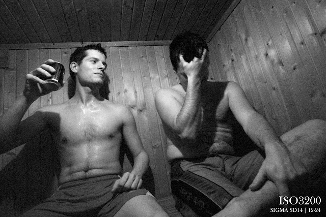 |
| High ISO Photo II |
Like before, this photo is extremely grainy, as a high ISO of 3200 was used.