Wednesday 19 April 2017

Still Life Drawing


Do note that the piece is unfinished.

For the classes still life realism project, we were given a selection of four sections to draw. I chose the bear skull, alongside flowers. I started the contour first (as one should), albeit heavier than one should draw, as it's simply a habit of mine. Specifically though, I drew first the left-hand skull (a bear's if I'm not mistaken), the entire picture was designed around that specifically; it is the focal point. The flowers came in second, however I had the bravado to "cut and paste" parts, which, I think, led to moderate success. One of the flowers was in the stance shown, and another (of the same type) was hanging somewhere else, so I merely pretended the other was alongside the first.

I was going for an L composition, with the flowers being the bottom half, and the top-most skull being the top half. until it became apparent I'd need to add more to truly highlight the composition, so I took another skull, which was nearby and "pasted" it into the frame, the lighting was all there so things were made far simpler. I then chose to add another section of flowers above the left skull, however it was hardly broken in by the end of class time. The negative space would've been a simple manner of adding in creases and folds from the white sheet behind the subjects.

Overall I'm proud of my left skull, and likely would be proud of it overall, had I finished it with the time allotted.




Digital Self-Portrait


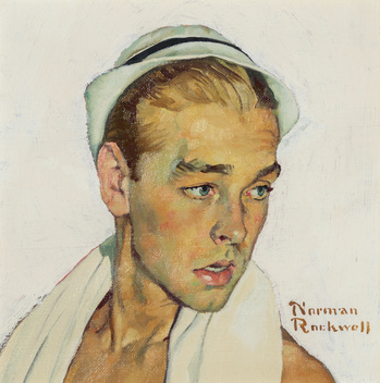
Image result for norman rockwell
The Norman Rockwell piece that inspired me to do his style.
Originally I was intending to do the 1950s - 60s "retro futurism" style, magazines talking of the wonders of all-American science, and "the world of tomorrow-today". It became heavily apparent that it wouldn't be feasible unless there was more in the image, which the rules don't permit, it is a self-portrait after all. I also didn't have the wardrobe to pull off such a style. So alternatively, I moved to a separate style, that being the regular-stylized (however still eccentric to today's standards) 50s and 60s magazine style, examples being vintage Coke Cola ads and such. However after that I still felt discouraged to continue, as eventually I'll be tasked with painting the photo, and it was just far too difficult, so I moved on to one final (yet still similar) style. The style in question was inspired by 20th century painter Norman Rockwell, so really, a more classical form of realism, with a tinge of post-impressionism (I find that the colours of skin tend to be similar in some pieces). As for the photo work, I did a very comical pose, one that would assimilate perfectly with a Rockwell piece.

I used a high contrast, with a brightness setting to severely lighten the light areas and darken the dark areas. I then, admittedly with recommendation from a classmate I added an orange light to it all, which really does push the Rockwellian style.  I used the dry-brush filter to really push the painted style and "2 dimensionalize" my hair and my teeth. And lastly I added a simple texture filter, specifically canvas, to really cement it as a painting.


Overall, I'm incredibly satisfied with what I did, however I regret it overall, as I feel as though I should have picked Pop-Art at the very beginning. I felt compelled not to, as at least half of the other students had chosen it, and I feel like I'd be stuck in a rut if I was a part of a collective such as that. However, all along I did intend on this style, I'm just afraid that it will be extremely difficult to paint, as I've narily any practice in the medium. So while this is going to come and bite me later on, I am still happy with the product, and I have no regrets at all regarding the actual process.